
Navigating the digital landscape can be tricky – especially when optimizing your product pages. Your product page is more than a showcase for your offerings. It’s a digital salesperson. A stellar product page design is vital whether you’re dealing in e-commerce goods, digital products, or online services.
You’re not designing a page — you’re curating an experience. And it’s time to make that experience count. Welcome to the world of conversion-driven product page design.
In this piece, we’ll discuss product page design tactics that can boost the buying process and skyrocket your sales. We’ll offer actionable tips, industry insights, and data-backed strategies. They can help you revolutionize your e-commerce store, regardless of the type of product you’re selling.
By the end, you’ll know how to give your product pages the revamp they deserve. Let’s begin!
Use trust badges to generate confidence
Trust badges act as digital confidence boosters. They serve to reassure potential buyers about the legitimacy of your brand. They also confirm your brand’s commitment to quality, safety, and transparency. That can be the gentle nudge a customer needs to complete the sale.
A study by the Baymard Institute revealed that 18% of potential customers abandoned their shopping carts due to a lack of trust. You can reduce this percentage by displaying trust badges on your product pages. That way, you can push potential buyers past their uncertainties.
Take the example of Transparent Labs, a natural sports supplements brand. Notice the various trust badges across their product pages. Well, they’re there to instill confidence in Transparent Lab’s offerings. Donation pages can also use trust badges to show donors that their donations are secure and their personal information will be protected. Additionally, donation pages can use clear and concise language to describe the organization’s mission and how donations will be used. This can help to build trust and confidence with potential donors.
Check out their Creatine HMB supplement product page. They declare this product as officially-tested, sugar-free, gluten-free, non-GMO, and more. By doing this, they reassure customers about the quality and safety of the supplement.
This strategy not only communicates their commitment to health and safety. It also elevates their transparency, cultivating trust and boosting their conversion rates.
These digital badges are a simple yet powerful tool in your product page design arsenal.f Make sure you’re using them to the fullest. Show your potential buyers that you’re a brand worth trusting.

Source: transparentlabs.com
Address shipping costs and timelines
Transparency around shipping costs and delivery times is a critical factor in conversion. Customers want to know about the delivery charges for their chosen products. Additionally, they crave accurate info on the estimated arrival time of their purchases.
Keep this information clear, upfront, and accessible on your product pages. It’ll help enhance the customer experience and drive conversions.
Let’s revisit the same study by the Baymard Institute mentioned above. It notes that 48% of online shoppers abandon their carts due to high extra costs like shipping and taxes. Many of them show up only at checkout. So, make sure to state the shipping costs and delivery dates on the product page. That’s how you’ll prevent this surprise and potential loss of sales.
An excellent example of this tactic in action is Amazon, the e-commerce giant. When a user selects their location, the website displays shipping costs and estimated delivery dates.
For instance, check out the WYZE Security Camera product page. You’ll find this information right in the sidebar. That way, customers know what to expect before they hit “Buy Now.” They even provide a countdown to the cutoff time for next-day delivery. Doing this adds a sense of urgency that encourages immediate purchases.
This practice gives customers the transparency and convenience they crave. No surprises and no hidden costs. Just a straightforward, honest business that encourages trust and, as a result, conversion.
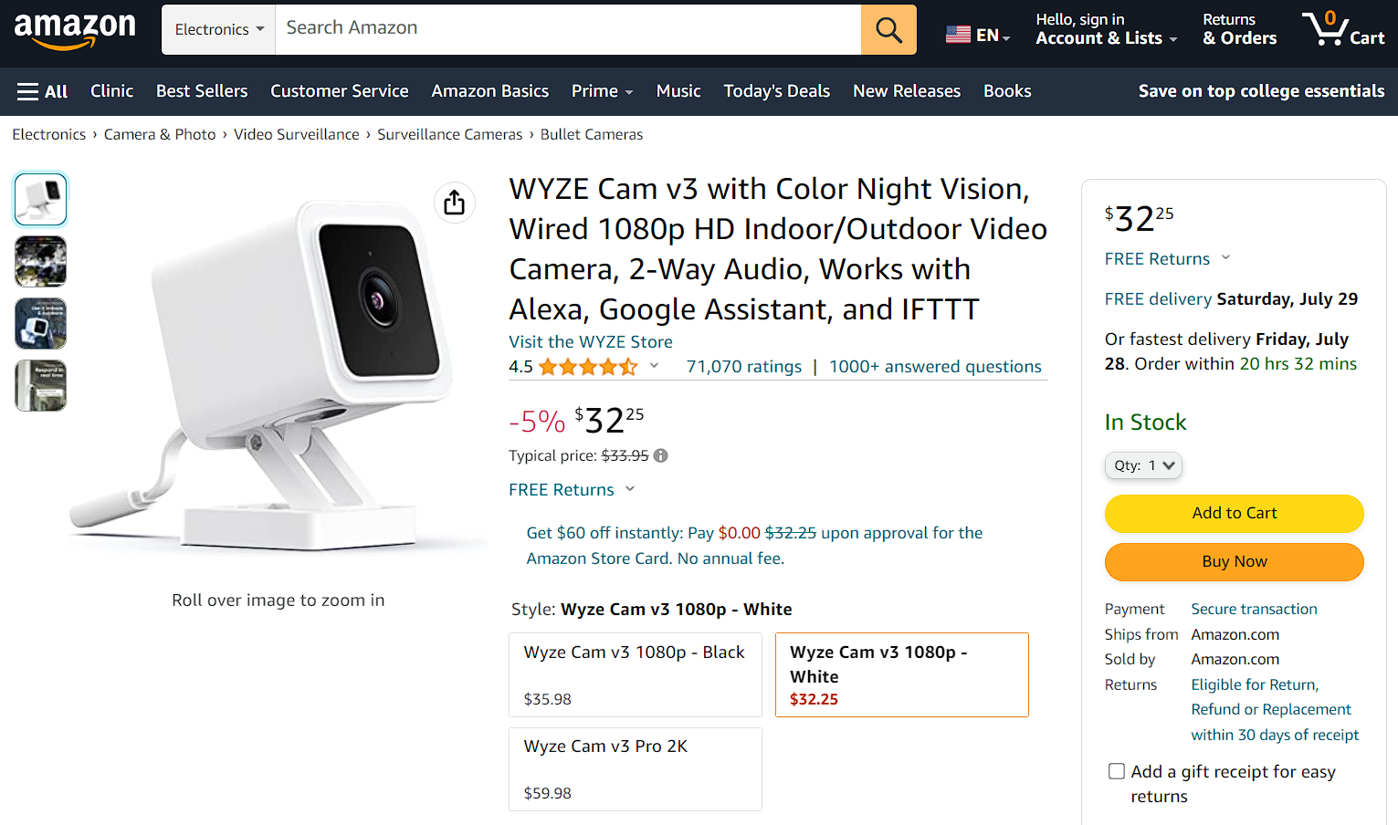
Source: amazon.com
Display an enticing product demo
Showcasing an engaging product video demo can be a game-changer. This interactive element allows potential customers to “experience” your product while shopping. That increases their confidence in its value and functionality. Demonstrating the features of your product to customers can go a long way. It’s far more impactful than product descriptions or even product images.
According to a Wyzowl survey:
- 96% of individuals have watched explainer videos to learn about a product or service.
- 88% of customers report that watching a video has persuaded them to buy their product or service.
These figures speak volumes about the effectiveness of product demos in driving conversions.
A prime example of this strategy in action is MarketBeat. This brand is a leading provider of stock market research tools. Their page on penny stocks features a detailed demo of their report on said shares.
The page displays the basic product for free. Users must pay for the extra value-added filters. This demo provides immediate proof of the product’s value and efficacy. It stands as a more convincing sales pitch than a written description could ever be, driving user engagement and ultimately increasing sales development activities by converting interest into action, resulting in measurable business growth and long-term customer loyalty.
The power of “show, don’t tell” is vital in product page design. So, go ahead and craft an irresistible product demo. Leave your potential buyers with no choice but to convert and buy.

Source: marketbeat.com
Tell customer stories
In the quest for conversion, the power of social proof is an asset you don’t want to underestimate. Marketers have established that real-life customer stories positively impact your credibility.
80% of consumers trust online reviews as much as personal recommendations. A Spiegel Research Center study found that customer reviews can boost conversion rates by 270%.
Encourage your customers to communicate with you through video testimonials or user-generated content. Once you have customer feedback on your product pages, potential customers see what it’s like to use your product. This feedback reaffirms their buying decision.
One brand leveraging this strategy is GoPro, an established action camera brand. Their HERO 11 Black product page often features user-generated content. It ranges from stunning photos to captivating videos shot using their cameras. These real-life showcases highlight the capabilities of their products. They also allow potential customers to envision using the product in their own lives.

Source: gopro.com
GoPro also uses video submissions. The company awards ordinary users for submitting photography and filmmaking content. These videos serve as case studies. They highlight using GoPro products in everyday and professional settings.
Incorporating customer stories into your product page builds trust with potential buyers. One shouldn’t underestimate the power of peer-to-peer influence. So, let your satisfied customers do the talking.

Source: gopro.com
In the digital marketplace, simplicity is always beneficial. Businesses that offer a range of products improve conversion rates by making product comparisons easy.
A well-designed user interface empowers potential buyers to find the best option. All without the need for endless clicks or deep dives into many pages.
As you guide your customers on their buying journey, simplify their decision. They’re coming to your product website without the same understanding of your products as you do. They need a simple, clear, and accessible platform that allows them to compare options effortlessly.
Getsafe, a company specializing in medical alert systems, exemplifies this strategy perfectly. They present their various packages in a clear, visually appealing way on their Medical Alert Plans page. That makes it easy for customers to see what each option includes.
They simplify the decision-making process for potential buyers by demonstrating their products’ features.
Designing a product page that makes comparisons simple is about more than just aesthetics or UX design principles. You should strive to provide this option to show you understand your customers’ journey. Do it to show that you’re willing to make that journey a walk in the park. That way, you increase the likelihood of a sale and enhance the online shopping experience.
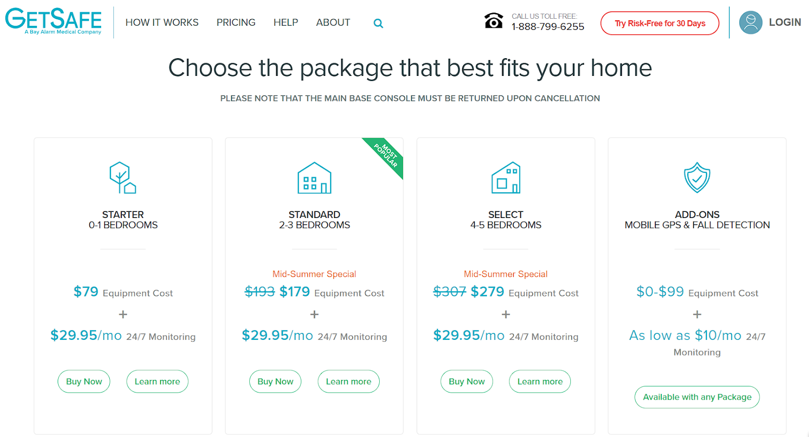
Source: getsafe.com
Be transparent about refund and return policies
In any business, transparency is the bedrock of trust. This holds especially true for online stores. Clarity about your return and refund policies offers a reassuring safety net to customers.
Transparency allows your customers to know that buying from you is risk-free. It also lets them know they have a clear route to getting their money back if the product doesn’t quite meet their expectations. This sense of security can boost their confidence to move on with a sale.
Refund policies should be upfront, easy to understand, and immediately visible. That reassures your customers that you’ve got their back, even post-purchase. This display of transparency enhances your credibility. It also deepens the trust and strengthens the bond between your brand and your customers, an essential part of shaping a strong and consistent brand identity.
Take a leaf from Zappos’ book, the renowned online retailer of shoes and clothing. They’ve set an excellent example with their “365-day return policy.” You can see it on all their product pages – including this one for Birkenstock Sandals.
They offer free returns, granting customers an entire year to decide their satisfaction level with the product. This boldly articulated policy helps convince customers to make a purchase. Feeling sure about Zappos’ commitment to their satisfaction helps customers decide to buy.
Establishing trust goes beyond securing a sale — it’s about nurturing a long-term relationship. By being transparent about your return and refund policies, you prove to your customers that you’re in it for the long haul. Even after they’ve hit the “buy” button.

Source: zappos.com
Find a balance between product features and customer value
With digital products, articulating product features alone isn’t enough to drive conversions. What matters is communicating the tangible, measurable benefits these features offer the customer.
Here’s where the balance between describing product features and conveying customer value comes into play. When designing your product pages, translate product features into real-world benefits. Does your product save them time or money? Can it boost their conversions? If so, by how much?
Consider Slack, the popular project management and collaboration tool. Their sales product page doesn’t just list features like “channels” or “searchable history.” Instead, they explain how these features work:
- enable cross-platform integration
- smoothen team communication
- improve sales productivity
- save time
A good product page not only sells a product but also provides a solution to a problem. Highlight the value your product delivers in real, measurable terms. That way, you give buyers compelling reasons to choose your product. After all, they’re not just investing in your product. They’re investing in the benefits it delivers.

Source: slack.com
Have an extensive gallery
Visual content is a powerful tool for engaging and persuading potential customers. A well-crafted gallery provides visitors with a solid understanding of your product, its features, and its use cases. Having one can help you showcase your product and enable customers to visualize how it fits into their lives.
An effective product gallery extends beyond high-quality images of the product itself. It shows your product in action and provides context for scaling. It might also use innovative technologies like Augmented Reality (AR) to offer a more immersive experience.
For instance, consider IKEA’s product pages. The furniture brand uses AR technology to help customers visualize furniture pieces in their own space. This experience helps customers see how the product looks and fits in their homes. It eases their decision-making process and increases the likelihood of a sale.
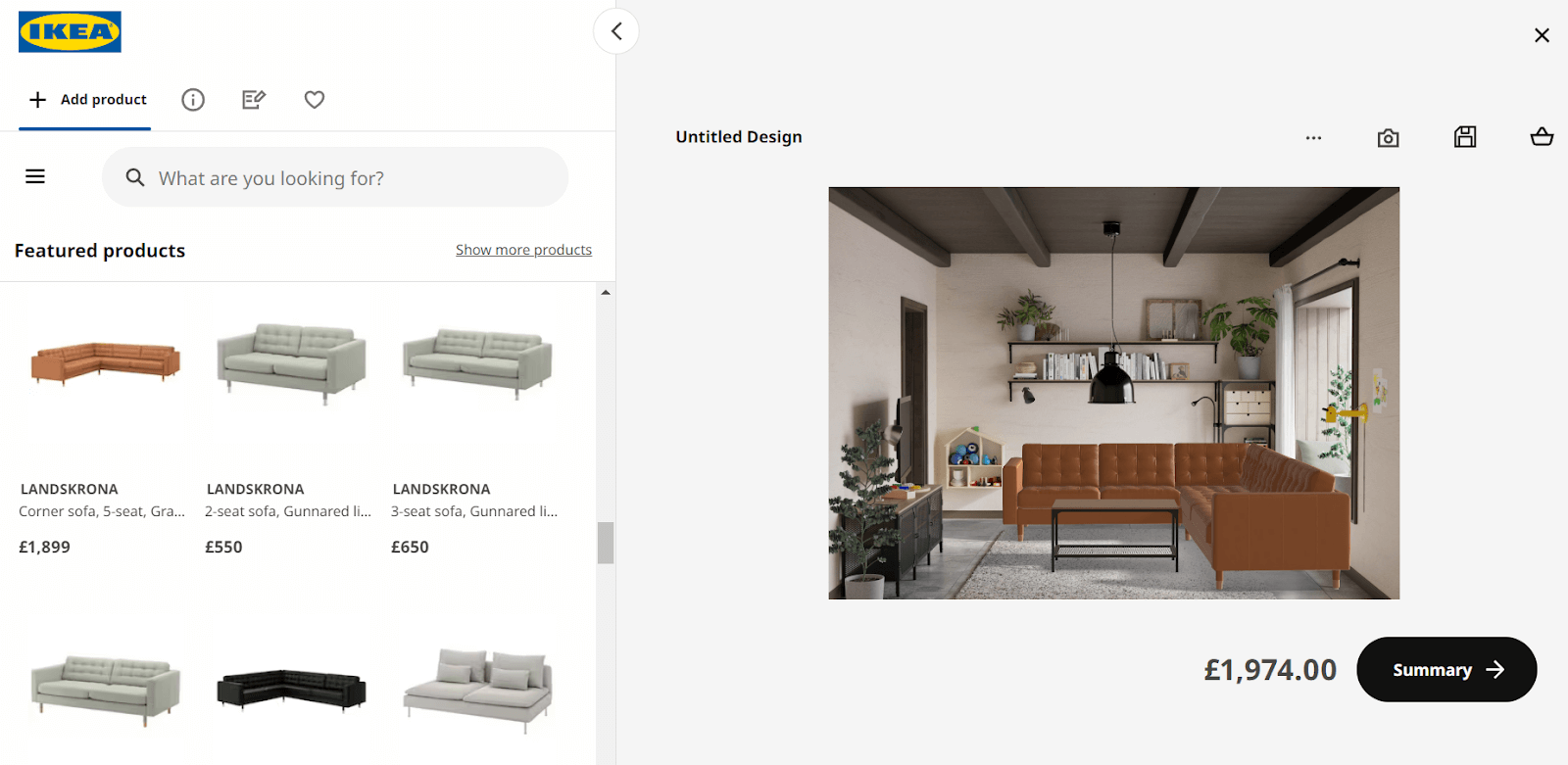
Source: ikea.com
Likewise, showcasing your product alongside other items gives a more accurate impression. It lets customers grasp your product’s size, usability, and relevance. Videos demonstrating the product in action further enrich this understanding. They can create a dynamic visual narrative that speaks louder than words.
A diverse, comprehensive gallery turns your product page into a visual storytelling platform. It helps convey your product’s appearance in your customer’s life. So, invest in creating a robust gallery. Have this gallery communicate your product’s tangible, real-world value from every angle.
Wrapping up
Your product page is more than a digital storefront. It’s a platform for you to narrate your product’s story and highlight its value in the customer’s world. The tactics shared in this guide can help you do that.
Here, we learned that product pages must be captivating, intuitive, and customer-centric. Compelling product pages that speak to your audience’s needs and aspirations.
Every element plays a part in shaping your customer’s journey, from trust badges to extensive galleries. They’re an essential part of the online shopping experience. Thus, they can influence your customers’ purchasing decisions and boost conversions.
Aim for a balance between product descriptions and perceived value. Present straightforward refund policies. And why not try using easy comparison tools? These are all vital elements of an optimized product page.
Last but not least, remember that successful product page design isn’t a destination. It’s an ongoing journey of improvement, refinement, and adaptation to ever-evolving customer expectations.