
Your website header is the virtual handshake that greets visitors. Fail to make a positive first impression, and you’ll lose potential customers before they even explore what you offer. But nail that website header design, and you’ll be well on your way to capturing and nurturing quality leads.
Know that you only have moments to make this happen. Research by Hotjar discovered that 64% of consumers decide whether your site has what they need within just a few seconds of landing. The same report notes that a whopping 71% say that their first impression of a website directly impacts their brand loyalty.
This article will guide you through creating an engaging, conversion-boosting header for your own website. We’ll cover essential tips, header design examples, and best practices to guarantee your header sets the right tone, sparks interest, and compels users to stick around.
By the end, you’ll have a clear roadmap for website header design. One that creates a stellar first impression, helps build brand recognition, and nurtures valuable leads from the moment they arrive.
Be super clear about your value proposition
To engage website visitors and nurture leads, it’s essential for you to clearly communicate your value proposition.
Your value prop is the core reason someone should choose your product or service over competitors. When prominently featured in the header, it instantly answers the burning question: “What’s in it for me?”
Nailing this tactic means you’ll captivate users from the get-go and entice them to explore further. A solid value prop builds trust, sets expectations, and positions your brand as the ideal solution to their needs. On the flip side, a weak or absent one leaves visitors confused and more likely to bounce.
Here’s how to create a clear and effective value proposition:
- Determine what makes your product or service unique. Focus on the benefits that matter most to your target audience.
- Use straightforward language and avoid jargon and fluff. You want your visitors to understand your value proposition at a glance.
- Clearly articulate what you offer and how it solves a problem or meets a need. Avoid vague statements that don’t provide concrete value. Think of crisp language that immediately resonates.
- Emphasize the benefits of your product or service rather than just listing features. Explain how it improves the lives of your customers.
For example, highlight how you solve a pain point more effectively than competitors. Or if you offer a unique feature, make that the star. Just ensure it’s distinctive – you want to stand out from the crowd.
Here are two stellar examples of value propositions:
Chisos, a premium cowboy boots brand, demonstrates how to use a bold and clear value proposition. As soon as you land on this ecommerce site, you will see their value proposition front-and-center on a big hero image: “Damn comfy cowboy boots.”
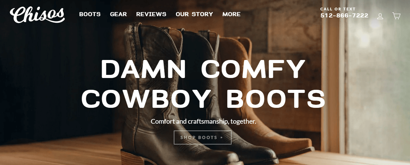
Source: chisos.com
This statement is short, memorable, and effective. It immediately tells visitors what Chisos offers – comfy cowboy boots. It also conveys the brand’s unique style and attitude. The conversational tone oozes a personality that aligns with their brand identity.
As a SaaS company, bulk text messaging service DialMyCalls takes a more descriptive approach.
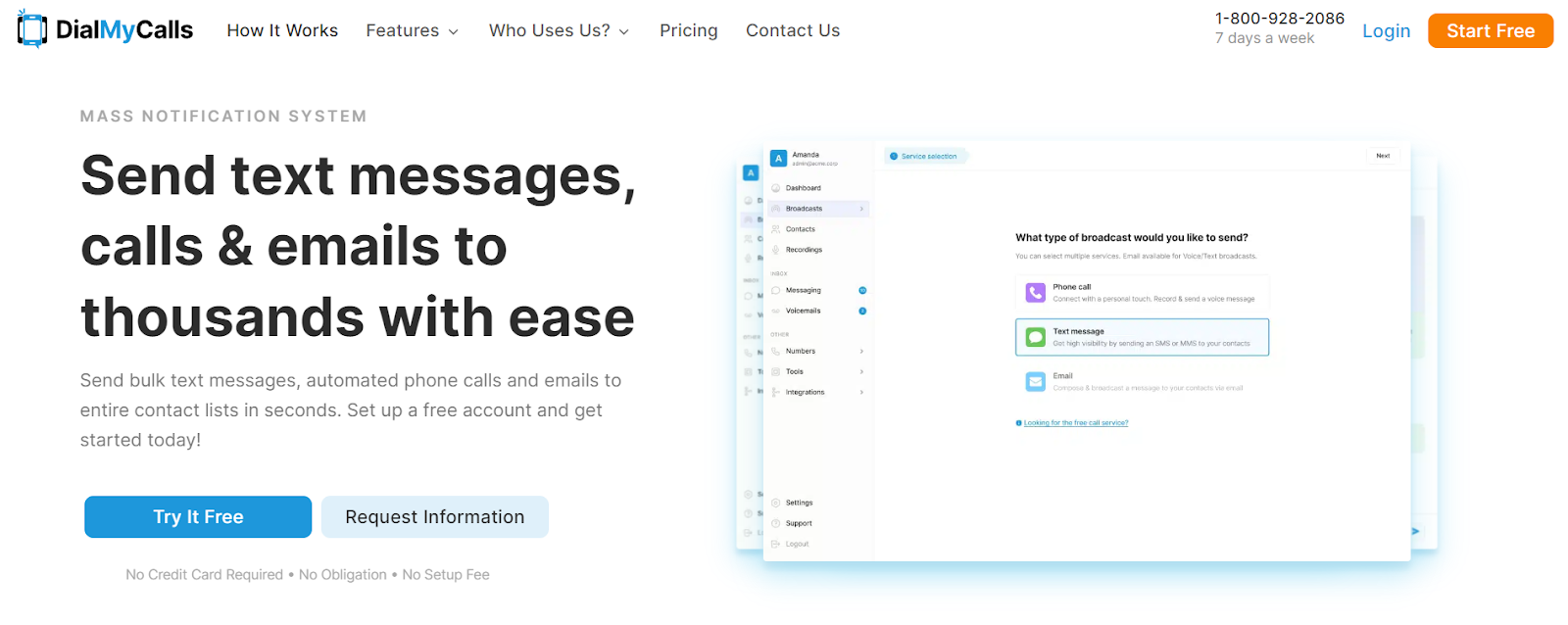
Source: dialmycalls.com
While longer, the header still explains their offering in a simple way. The all-in-one description resonates with their B2B audience.
Once you have refined that compelling value prop, feature it in your website header. Whether through concise header text, a short branded video, or both – make sure it’s one of the first things users see and digest. That instant clarity shapes their perception from the start and nurtures them along the conversion path.
Showcase your product
Visually showcasing your product in your website header is a powerful way to engage visitors. It also instantly communicates your brand’s value. Leveraging tools like a campaign calling center can help ensure proactive brand communication, making customers feel supported and valued.
Humans are highly visual creatures, so vivid imagery that spotlights your offer helps visitors grasp the value and appeal. It builds instant understanding and interest.
When done well, this tactic makes an impactful first impression. It removes the guesswork and sets accurate expectations from the start. Seeing the product in an appealing, aspirational contexts sparks an emotional connection. That connection will help nurture leads through your sales funnel to conversion.
Here’s how to effectively showcase your product:
- Invest in professional photography or videography to capture your product in the best light. High-resolution images and videos can significantly enhance your site’s visual appeal.
- Imagery should feel authentic and aspiration, not cheesy or over-produced. So, display your product by using realistic settings, props, and models that resonate with your target persona. This relatability forges trust and helps users envision themselves as owners or customers.
- Avoid clutter in your header. Ensure that the product is the focal point and that any accompanying header text is concise and to the point.
- Use visual elements to emphasize your product’s unique features and benefits. This can help visitors quickly grasp its value proposition.
- If possible, add interactive elements to your website header. Think clickable hotspots or short explainer videos. This can enhance user engagement and provide additional information without overwhelming visitors.
When incorporating product imagery, you need to make sure it’s the focal point and visible above the fold. Feature it as:
- A static background image
- An animated carousel
- An eye-catching video that autoplays
Ensure the visuals are vibrant, high-res, and aligned with your brand identity.
Sometimes, even small design tweaks can make a big difference in how your product is perceived. For instance, refreshing outdated visuals or aligning imagery with seasonal campaigns may only require you to change the background of your header photo rather than replacing the entire asset. This approach helps maintain brand consistency while saving time and creative resources.
Our first example of this strategy is Pergola Kits USA, a brand that sells ready-to-assemble pergolas.
Their homepage header features a stunning photo of one of their products adorning an idyllic outdoor living space.
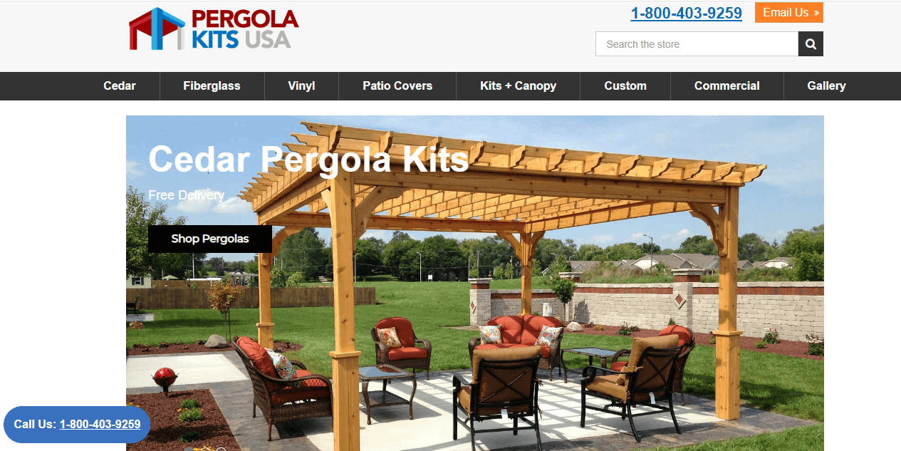
Source: pergolakitsusa.com
This image instantly communicates their offer and the lifestyle benefits of comfort, beauty, and enhanced outdoor living. Also, note the prominent company logo in the left corner.
That logo placement works because it gives visitors a clear brand cue without distracting from the product itself. The header still lets the outdoor scene do the heavy lifting, but the logo quietly reminds users whose product they’re looking at. This balance is important because strong headers need to feel visually engaging while still being easy to identify and remember. In a header where visuals do most of the storytelling, thoughtful logo design helps tie the scene back to the brand and makes the first impression more memorable.
Pinch, an in-home med spa service, has its navigational elements at the very top as a sticky header. But then Pinch goes for a somewhat creative website with a next-level approach. They display a compelling video that shows their nurse practitioners arriving at clients’ homes and providing expert treatments.
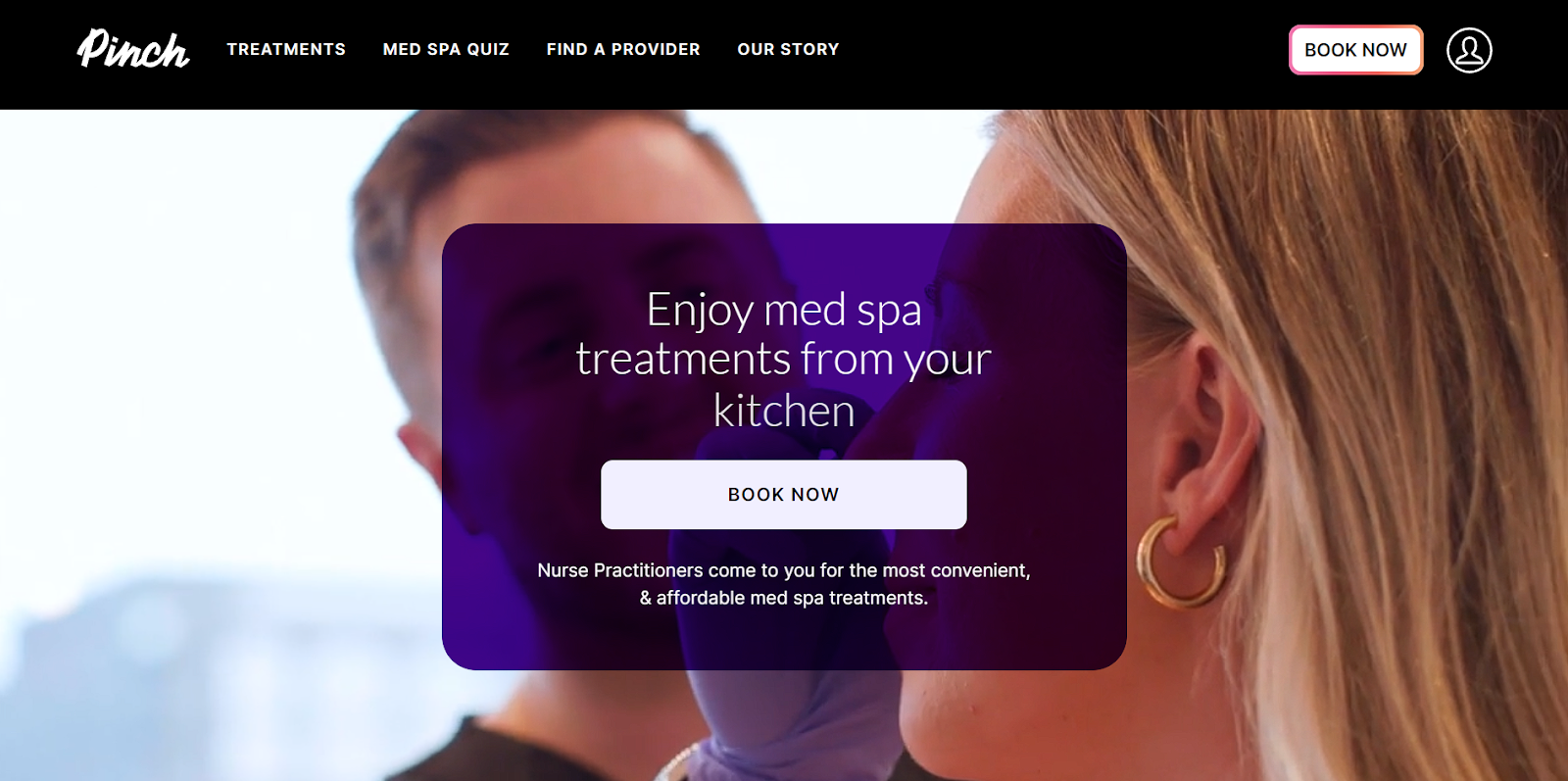
Source: bookpinch.com
Seeing the experience in action offers a unique perspective. It emphasizes their professionalism and personal touch.
Humans buy with their emotions. Featuring your product or service in the header offers the opportunity to immediately begin forging a relationship with website visitors. You provide them with value, authority, and trustworthiness immediately. From there, it’s up to you to nurture them through your marketing funnel.
Offer visitors something immediately
With this tactic, you create excitement and reduce hesitation that could cause visitors to bounce.
On top of that, strategically placing a CTA next to your offer in your header can boost revenue by up to 83%.
Here’s how to tackle this approach:
- Present an attractive, frictionless offer that aligns with your audience’s interests and needs. It should be something quick and easy to claim, like a free guide, trial, coupon, video series, etc.
- Make sure it’s genuinely valuable and relevant to your products/services.
- Craft concise, benefit-focused copy that states what you are offering and what’s in it for them. Use active language like “Get” or “Download” to spur action.
- Then, make that CTA button or form easily visible and accessible without scrolling. You want the offer to jump out and reduce barriers to opt-in.
Love the Night Sky, an astronomy website, nails this. Their hero header grabs attention with: “Get Started With Our FREE Astronomy Video-Course.”
Underneath is a prominent pink button reading “Sign Up Today.” The language is clear and compelling. The friendly, color-contrasting button removes friction to claim the freebie.
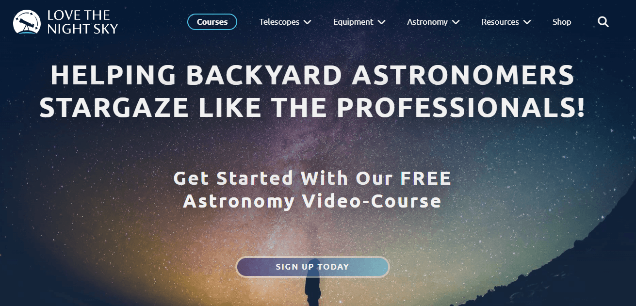
Source: lovethenightsky.com
Capture interest and contact details from promising leads with an incentive that offers value. Demonstrate your expertise in exchange for email addresses. Nurture your leads with the value you promised. As they move through your funnel, you’ll build trust and they’ll move closer to conversion. Just be sure to deliver on that initial promise of value.
Use white space to emphasize your message
Leveraging white space (or negative space) is a powerful web design technique. It allows your core message and call-to-action buttons to pop and command attention. By giving breathing room around vital header elements, they become visual cues that are impossible to overlook.
Implementing this tactic prevents overwhelm and directs users’ eyes exactly where you want them. It strips away distractions so that the high-impact content takes center stage.
Using white space like this directs attention toward your value proposition, product highlights, and improves user experience in general while leading potential customers to the next step.
Here’s how to draw attention to what matters most:
- Be intentional about what’s most important to spotlight. Then, surround it with ample blank space, creating a visual pause.
- Use padding, line breaks, and spacious layouts generously around headers, call-to-action buttons, and impactful images/videos to let them breathe.
- Balance the use of white space with the rest of your design. Experts of Clickysoft, a Houston web design company, recommend finding the right balance to create a clean and engaging user experience.
Devtico, a software integration consultancy agency, is a prime example of this approach. Their website header features an empowering message paired with two CTAs. It’s all enclosed by vast negative space.
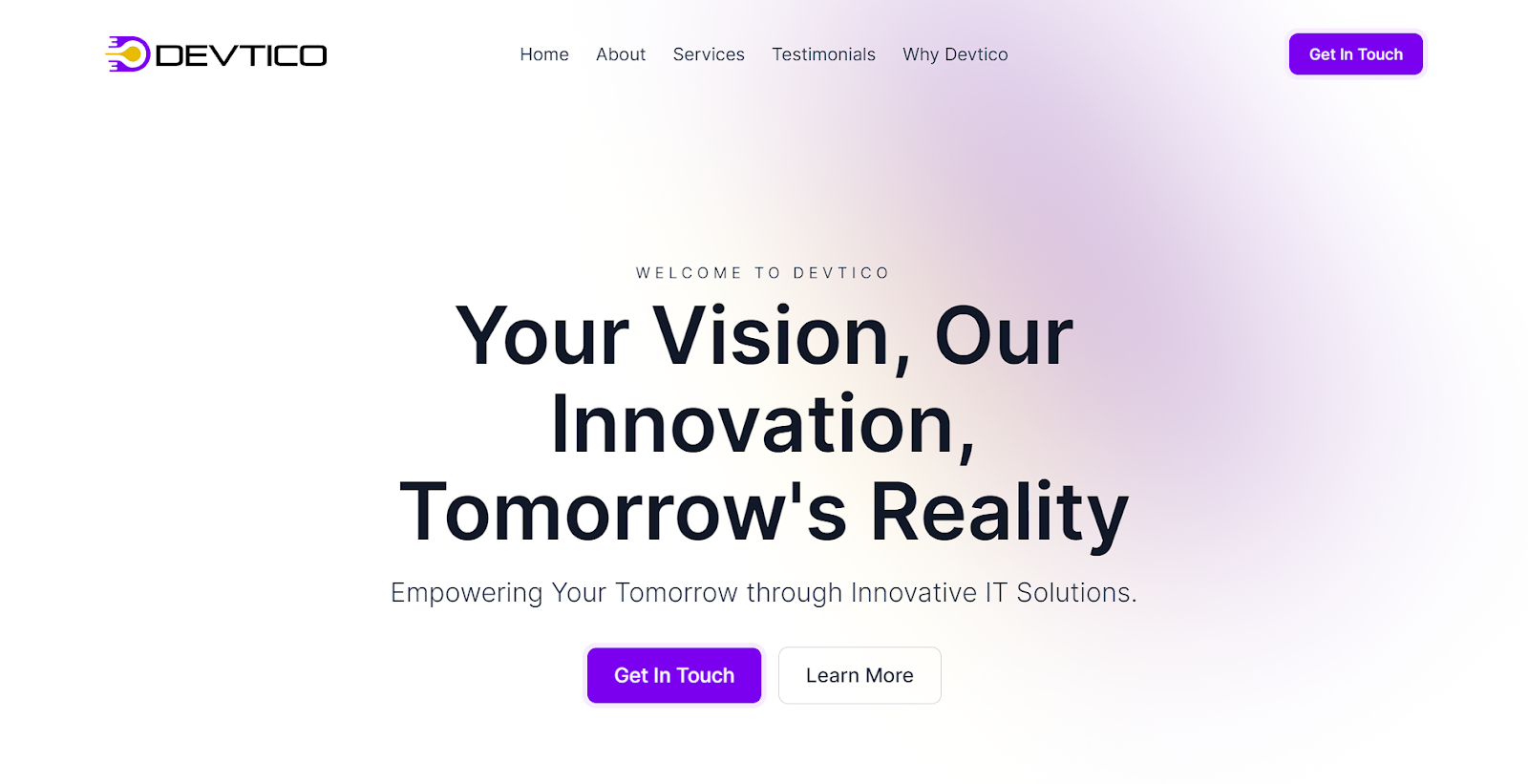
Source: devtico.com
The lack of visual clutter signals authority and confidence. It shows Devtico understands its audience’s needs. It provides the seamless, innovation-enabling solutions promised.
Ample negative space cultivates a sense of trust and promotes a seamless user experience. All this is essential for a technical service like theirs.
Leverage the power of urgency
Creating a sense of urgency and scarcity in your header design can be a powerful psychological trigger to drive conversions. When visitors feel they may miss out on a limited-time offer or discount, it prompts them to take action more quickly before that opportunity passes.
This principle is often used effectively in outsourced sales development, where specialized teams leverage urgency-driven messaging to push prospects further down the funnel.
Leveraging urgency strategically can boost engagement and accelerate sales cycles. This is especially relevant for ecommerce websites, where omnichannel marketing companies help brands deliver time-sensitive offers consistently across email, social media, and other touchpoints. After all, no one wants to feel like they’re missing out on a great deal or letting something valuable slip through their fingers.
Here’s how to create urgency and capitalize on it:
- Strike the right balance – you want to call to action but avoid coming across as gimmicky or overly aggressive.
- Lead with an enticing copy that clearly explains the time-sensitive promotion. Then, support it with displays of the deadline, countdown timers, or stock levels, if applicable.
- Be transparent about the details, and don’t make false claims. Limited-time offers should be genuinely limited. If promoting low inventory, keep counts accurate in real-time. Overhyping or extending fake deadlines damages credibility.
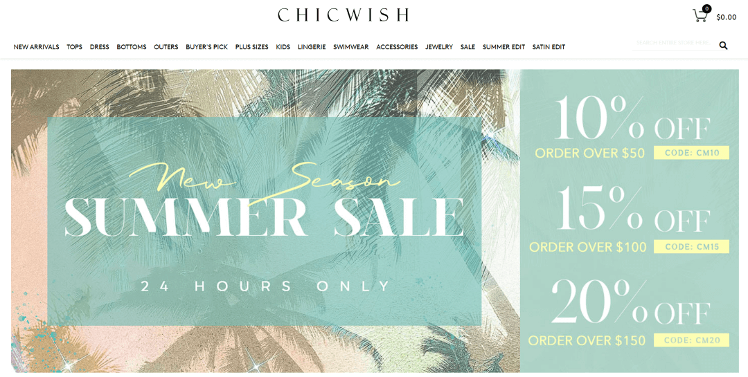
The ecommerce apparel brand Chicwish does this brilliantly in the header. Their message announces a “24 Hours Only” sale and several discount codes.
This presentation creates legitimate purchase urgency without being spammy. Customers know that the window for extra savings is short, urging them to buy as soon as possible.
Implementing a website countdown timer can further enhance this sense of urgency. By displaying a ticking clock indicating the time remaining for a special offer, visitors are more compelled to take immediate action, thereby increasing conversion rates.
Creating urgency can be a powerful motivator for driving leads into an accelerated buying cycle while supplies or discounts last.
Highlight social proof
Showcasing social proof, such as customer reviews, ratings, or impressive stats, is a powerful technique for building trust and credibility with website visitors right from the start.
This form of third-party validation alleviates skepticism. It also nurtures leads by demonstrating your product’s real-world value.
When people see others having positive experiences with your brand, it provides reassurance that you deliver on your promises. This is far more influential than touting your own marketing claims.
Here’s how to incorporate social proof on your website’s header:
- First, identify your most impressive social proof data points. Determine where to place them in the header area strategically.
- Star ratings, review snippets, numerical stats, and respected customer logos all make compelling additions.
- When highlighting stats or customer logos, provide context around the numbers or brand names. Doing this helps maximize credibility and impact. Don’t just state “1 million users.” Say: “Over 1 million small businesses trust our software.” That extra detail enriches your claim.
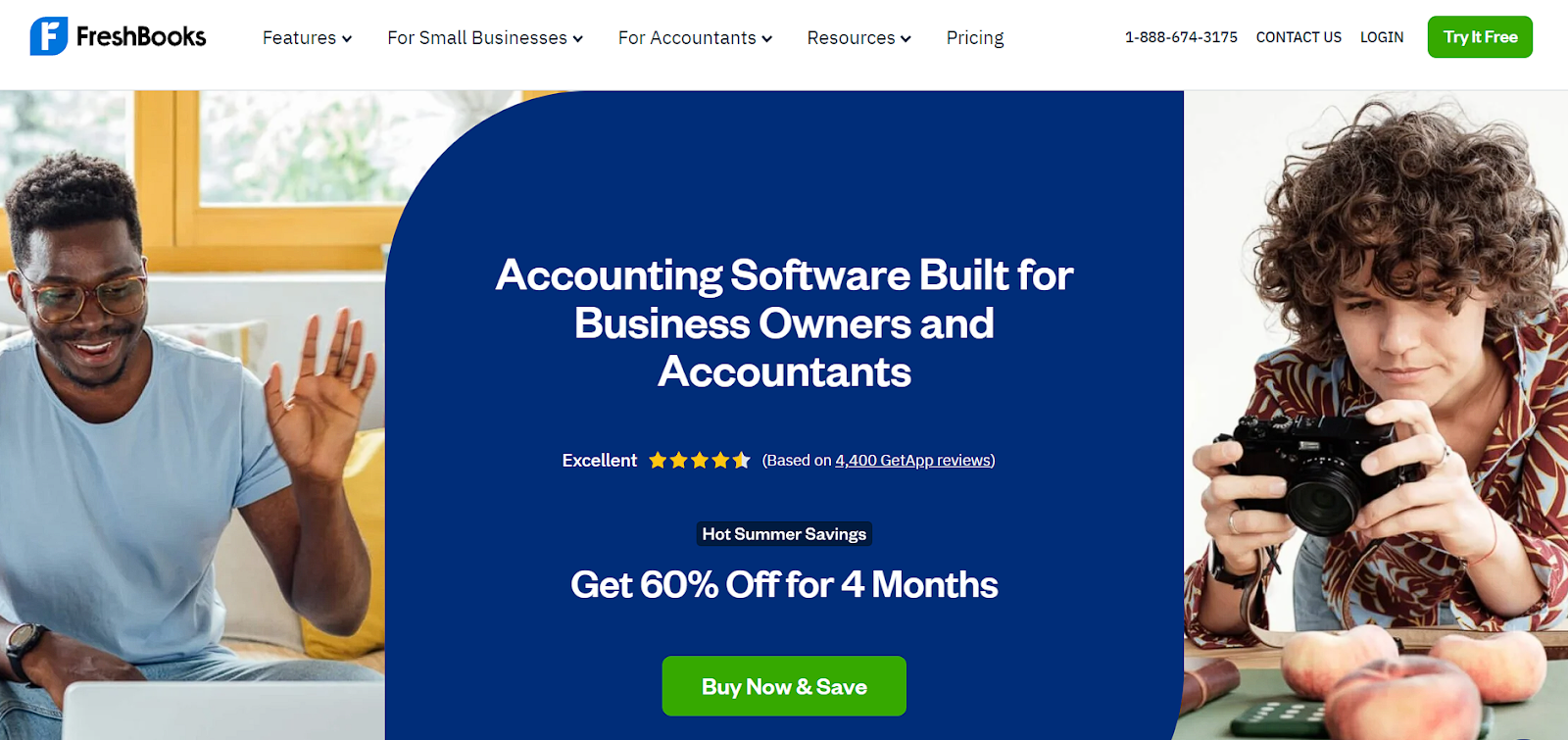
Invoicing and accounting software FreshBooks does this masterfully. They include their excellent star rating from over 4,400+ customer reviews directly in the header.
They take it a step further by hyperlinking to the full reviews. This allows curious visitors to explore the glowing testimonials the star rating represents easily. Following this example, consider including social media links to user-generated content about your product.
Source: freshbooks.com
People inherently prefer following the herd over forging new paths. By showcasing your army of satisfied customers and clients front and center, you reduce barriers and nurture leads down the path you’ve proven successful for so many others before them.
Time to optimize your website header design
With a thoughtfully designed header that executes these strategies, you remove guesswork and friction while building brand recognition, trust, and desire. You guide prospects logically toward the next step in your conversion funnel, whether opting in, making a purchase, or initiating contact.
So, start optimizing today using these best practices for website header design. When your opening act instantly aligns with visitor’s needs and desires, you’re set to transform more of those visitors into brand advocates.